
Responsive Website Design & Development
What is responsive web design and why is it important? Responsive web design refers to the creation of websites that are easily viewed by a wide range of devices. They are websites that require a minimum or no need for scrolling, resizing, and squinting to see the content whether you are on a pc, a laptop, a smartphone, or a tablet. The webpage will have a single URL, so that the response to your particular device is automatic, and will not require you to visit an alternate site for optimal viewing.
What Does Google Say About Responsive Web Design?
Specifically, Google announced that media queries should be used as a method of deciding the rendering on each device to adapt to any screen size. In addition, they recommend using the “Industry Best” practices of web design which calls for the use of the same html code regardless of the device it is viewed on. Media Queries are an integral part of responsive web design which means that Google’s stance has clearly illustrated that they feel it’s important.
Recently Google came out with advice that illustrates they pay attention to responsive web design and that it is a part of their organic ranking criteria. And, if Google is paying attention to it, then everyone’s web design should too!

Rapidly growing mobile usage
Mobile web usage is growing at an extremely rapid rate that presents enormous opportunity. A website that is not optimized for mobile usage and performance stands the potential to leave an enormous amount of opportunity and business on the table. Our professional responsive designs deliver outstanding results from both desktop and mobile users.
Efficient in terms of both time and cost
Responsive website design can drastically cut down on development time and cost. Rather than spending the time and resources building a separate mobile website in addition to your traditional desktop website, the responsive design approach enables you to optimize your business for both desktop and mobile with a single website.
Best practice for ranking high in mobile search results
Responsive design is the preferred option when it comes to making your website both mobile and search engine friendly. By providing a single, dynamic version of your website to both desktop and mobile visitors, you make it easier for search engines to understand and serve your content.
Turn insights into action
Trinity Web Group can help you turn customer insights into actionable solutions for your business.
✔ More Google searches take place on mobile devices than on computers. (Source: Google)
✔ 80% of smartphone users use mobile phones for shopping research. (Source: The Google Mobile Playbook)
✔ Consumers spend 15+ hours per week researching on their smartphone. (Source: Google/Nielsen)
✔ 80% of mobile searches trigger store visits that happen within 5 hours of the initial search. (Source: The Google Mobile Playbook)
✔ 67% of shoppers were more likely to buy from a website that is compatible with mobile devices. (Source: IronPaper)
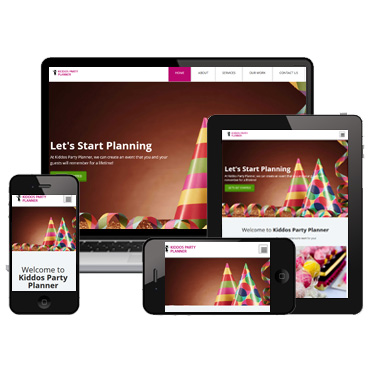
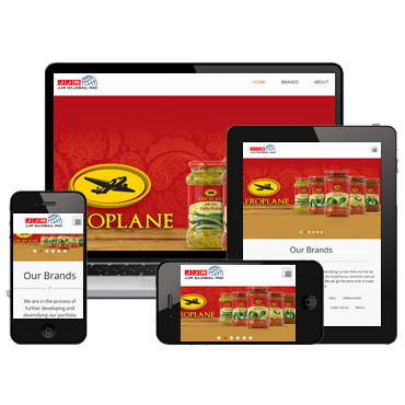
Our Recent Work & Case Studies

Request a Website Quote
We seek to create long-term relationships built on results.